
Macmillan Learning Accessibility Page
A redesign to Macmillan Learning’s accessibility page on their marketing website to improve site navigation and ensure an inclusive user experience.
Work Type: Openfield Work Summer 2025 | UI/UX
Applications: Figma
Project Summary
Problem
The old Macmillan Learning accessibility page is outdated and disorganized, causing high drop-off rates and student frustration due to difficulty finding resources and accessibility information.
Process
As the sole designer working with Macmillan’s accessibility team, our process includes:
Clarifying JTBD and user stories
Benchmarking website navigation and evolving sketches from lo-fi to final wireframes
Weekly progress sync meetings with stakeholders
UX reviews with the developers on initial screens
Impact
The accessibility team positively responded to the finalized wireframes of the accessibility page, noting that the long scroll length and word count of the original page are eliminated.
Intro
Problem
The Macmillan Learning Accessibility Page is Disorganized
Macmillan Learning’s accessibility page on their marketing website has not been worked on in years; it is a single page of walls of unorganized text and information. Students have expressed frustration, trying to find general accessibility resources on the page; and many users drop off upon seeing the long scroll length. As a result, Macmillan noticed a drop in site traffic to the page, losing potential revenue and adoptions.
Solution
Restructure the Accessibility Page for Better User Experience
Redesigning and updating Macmillan’s old accessibility page is the main goal. By improving site navigation, organization of topics, and having resources be accessible in a timely manner, the page will perform much better and address student and instructor pain points.
The Macmillan Learning Team
Senior Director of Accessibility
Senior Marketing and Website Manager
Senior Marketing and Brand Manager
My Responsibilities
Laid out jobs to be done to determine audience pain points
Set up the information architecture to better organize content
Sketched greyscale, lo-fi designs and iterated upon them via progress check-ins with stakeholders and critique circles
Finalized wireframes of the accessibility page, provided design specifications, and conducted rounds of UX reviews.
Planning
Jobs to Be Done
We started off by finalizing what the main jobs to be done were. Macmillan Learning’s main audience seeking accessibility resources are students, instructors, and sales representatives. By laying out the main JTBD, we can hone in on how we redesign the site, especially in terms of navigation.
Accessibility Considerations
Like all websites, we must make the redesigned accessibility page accessible and intuitive to use. Anyone should be able to easily navigate through the page.
Information Architecture
After finalizing our main JTBD, we then framed the information architecture of the accessibility page by auditing the old page and separating information into their own categories. Because everything was on one page originally, we definitely needed to break up and divide the content into their own subpages.
Ideation
Website Layout and Navigation Benchmarking
Before we designed the pages from the information architecture, we did some quick benchmarking on general website navigation, as that was a big pain point among Macmillan Learning site users.
One of the key stakeholder constraints on the design is that we needed to stay away from a top navigation bar, as they specifically stated to not have any more headers above, due to reducing visual complexity. Thus, our benchmarking had zero top navigation. In our benchmarking, we wanted to bring some vibrancy and a dynamic layout to the static page. Elements like open space between elements, visuals, drop-downs, tabs, cards, etc help organize the walls of text on the existing site and make the page more interesting.
Initial Design Concepts: Navigation
I sketched out various designs on how to best surface the site navigation. After conducting hallway testing with peers, users liked the visible side navigation to the left, as that is an existing pattern already used in both Achieve courseware and the marketing website.
Refinement
Improved Iterations
Focusing on the side tab navigation style, we evolved the designs further. We wanted the side navigation to be visible at all times, for better clarity and so that screen readers can interact with them. From here, I built out the rest of the accessibility pages from the information architecture. We wanted to lay out the content in a more dynamic, visually-pleasing way. Elements such as cards, images, icons, tabs, and accordion dropdown selections helped make the pages more exciting and less overwhelming.
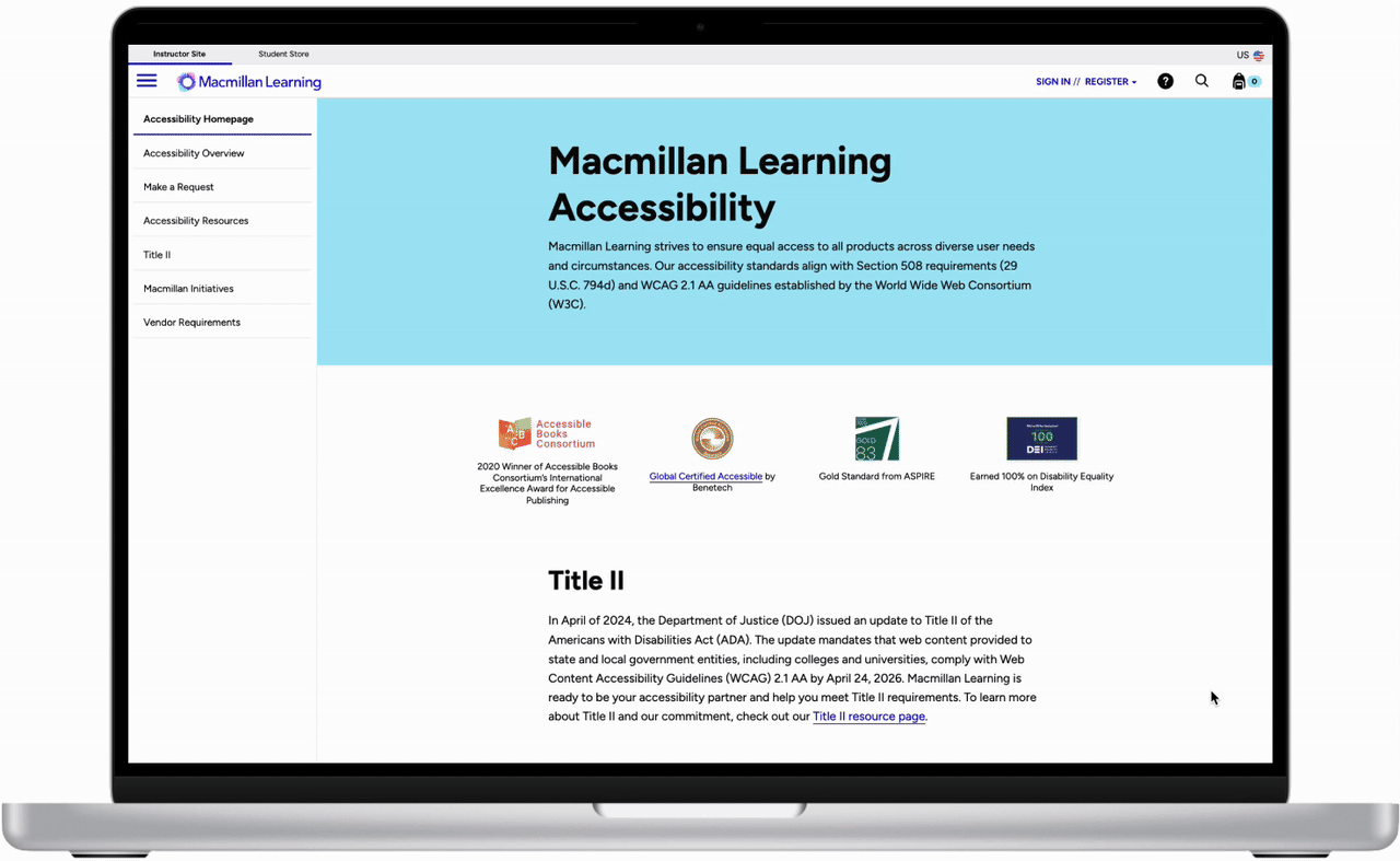
End Concepts
Final Designs
We utilized the new Macmillan Learning’s branding and styling, and applied it to our final wireframes. The Macmillan team was really happy with how the redesigned page turned out, especially with how all the content is displayed and organized. The new colors also make the page feel more modern. The site can be navigated via keyboard, and all images have alt text. All text is readable and the colors pass accessibility.
Impact
Resolved main usability issue of drop-offs and low traffic by eliminating long page scrolls and word count by ~70%
Organized content into their own subpages to help reduce information overload
Emphasized user stories, guiding students and instructors to pages that are relevant to them
Implemented the new Macmillan branding, evoking a modern and vibrant feeling
Takeaways
We worked on redesigning the accessibility page user experience on desktop; mobile view is currently being refined.
In the planning phase of this project, I found that laying out the Jobs to Be Done is especially important in knowing why we were designing the way we were. User experience considerations like low friction and good visual hierarchy are important in addressing our audience’s needs.